Whether we like it or not, advertisements are already part of people’s lives around the world. The history of advertising can be traced way back to ancient civilization. For capitalist economies, advertising has become a major force during the 19th century with the help primarily of newspapers and magazines. With the inevitable discoveries of new technologies such as radio, television, internet, and mobile devices, advertising in the 20th century is at its peak.
Commercials seen on televisions are advertisements. Whether it is trying to sell something or just plainly trying to get a message across about an issue, color is a major factor which often helps the audience or the viewers understand what the advertisement is all about. Color plays a big part in advertisement development and design. It is considered a tool that is used to induce communications across networks and to the viewers around the globe.
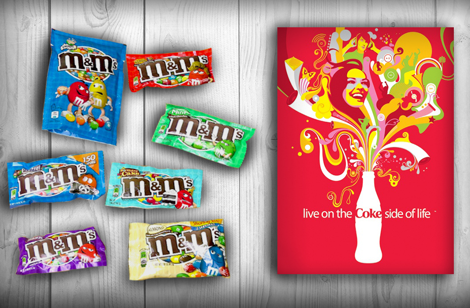
Since colors possess meanings, emotions are inevitable – they always go together. Colors can change our moods. Through colors, companies control the audience’s reaction towards an advertisement. Studies show that colors such as red, yellow, orange, pink, beige and similar are eye-catching colors that may represent courage, anger, love, or energy. They are considered warm, bright colors. These colors are often used in advertisements portraying love, food, or fashion. Lavender, silver, and azure are considered as cold, bright colors. These colors are effectively used towards commercials regarding health, cosmetics and medicine products. Cold dark colors such as violet, blue, green, turquoise, and navy are commonly used on business websites for government science and computer products. In terms of brands engaged in finance, crafts, and architectonics, the warm dark colors such as gold, purple, and brown are the perfect examples. Lastly, neutral colors are composed of white, grey, and black. They help create contrast and bring all the other colors out. Although they don’t convey a particular message on their own, they can be considered universal since they can work well in a variety of applications.
Colors must be powerful to convince their viewers, costumers or audiences. In a study conducted, the ASPCA website was used as an example. The website is all about animal cruelty and how it should be prevented. Shades of gray can be seen in their website with only color orange on the letter ‘P’ of ASPCA. The letter ‘P’ in the acronym stands for ‘prevention’ which is a positive thing and color orange is a positive color. On the other hand, it is said that the color red somehow increases a person’s appetite; hence, the color of the fast-food restaurants like KFC and McDonalds. They tend to get people hungry and eat as soon as possible. It would be confusing to the viewers if they will use cold and dark colors on their food products. It simply defeats the purpose of enticing their customers. Nobody would want their business to get wasted, right?
Indeed, an effective advertisement with the appropriate colors in use easily stirs a person’s emotion; hence, a successful conveyed message.
Recent Comments